Saturday, 28 February 2015
Friday, 27 February 2015

Thursday, 26 February 2015
Wednesday, 25 February 2015


Final Video
This is our Final Edit of the music video. The Video has now been uploaded to youtube where it can be seen.
Tuesday, 17 February 2015
Finished magazine ad
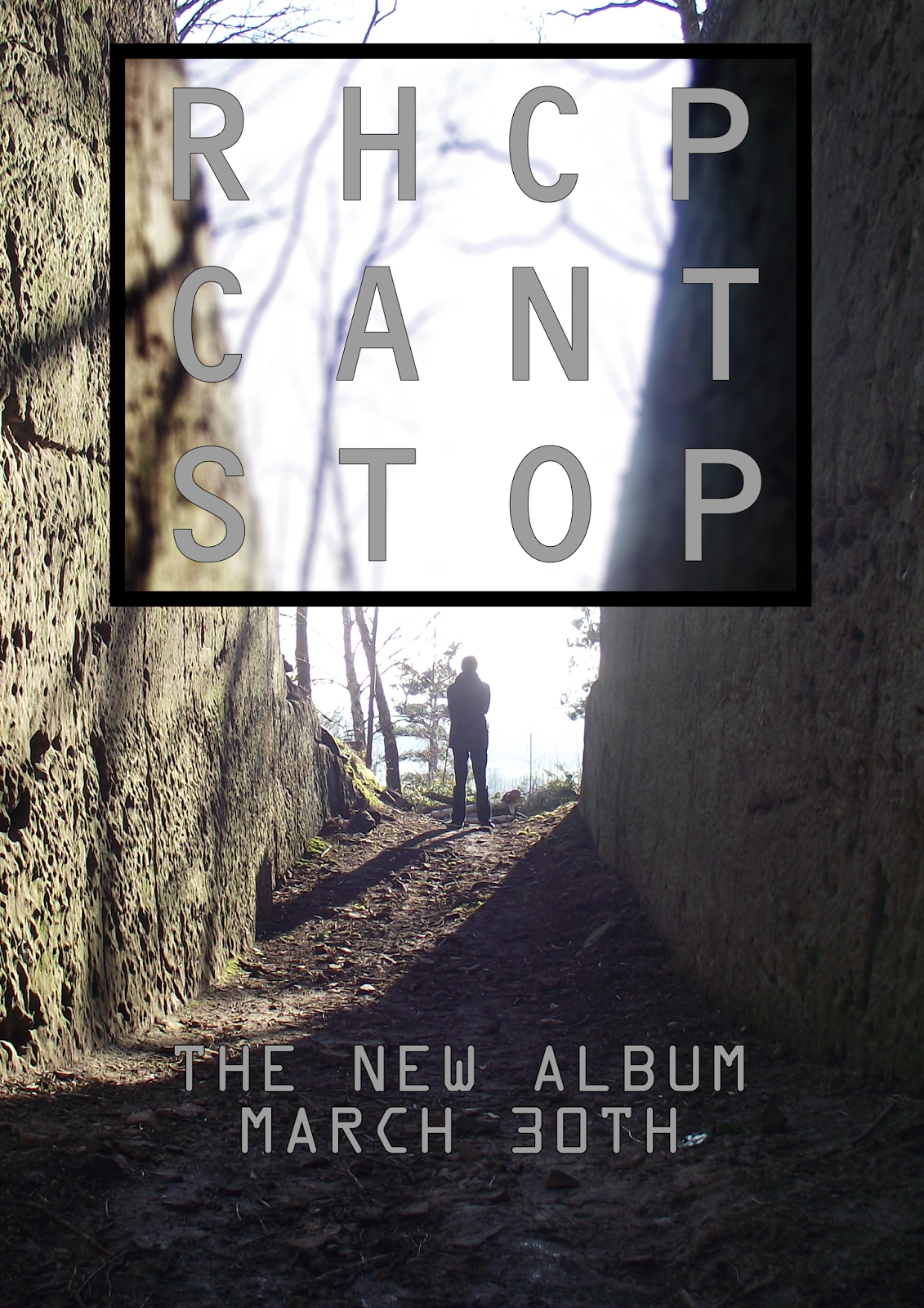
This is my final magazine ad. I have taken a very minimalistic approach inspired by the waterboys' magazine ad below.

Sunday, 15 February 2015
Making of the magazine advert
The only mildly special thing that i did on the magazine advert is to have the square that the writing is on have a darkened and blurred background.

I did this by first selecting the area inside the rectangle and adding a field blur to it. the field blur was then increased to make the background more blurred,


To make the background darker i changed the colour levels using the curves. The curve that i selected will make the blacks darker and the whites lighter. this creates more contrast in the colours and blurs some of the edges. This is also applied over the previous field blur to make the background stay in the background and bring out the text that is in front.
Saturday, 14 February 2015
Magazine advert rough plan
This is the rough plan for my magazine advert. I have taken inspiration from the waterboys in the style that i have done. This is just a plan on paper. My next step is to assemble it in Photoshop and see what it looks like and make changes from there.


I decided to use the picture that i put on the back of my digipak for the main part of the magazine ad. I planned out what i wanted on the magazine ad on a piece of paper. Seen as the magazine would be A4, using a piece of paper means that it'll be the same size. This also allowed me to work out sizing.
After doing a rough sketch of what I wanted on my advert, i then drew it out again but more neat this time so i could really see clearer what it would look like. This gave me a better understanding of what i was trying to do and allowed me to quickly make it in Photoshop.
Friday, 13 February 2015
Datamosh clip 2
This is the second datamosh clip that I will put into the video but it will appear in the video before the first. This effect was achieved by playing the two clips in reverse and datamoshing that. This would then be put into final cut and reversed again so would be playing the correct way. This means that the video will go from Moshed (pixelated) to normal and it'll play normally.
Wednesday, 11 February 2015
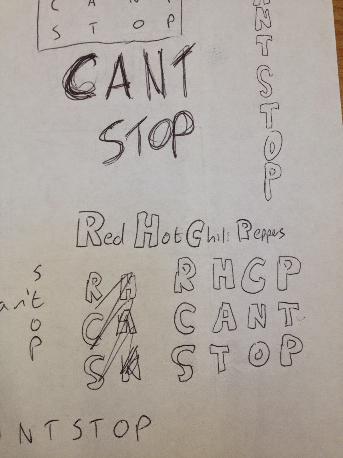
Digipak Title Brainstorm
I decided to Brianstorm what i wanted on the front of my digipak. I took a piece of paper and started doodling the Red Hot Chili Peppers name and Can't Stop. I then chose a design and started to refine it before coming to a conclusion.


Monday, 9 February 2015
Datamosh clip 1
This is the clip that will be added to the final music video. This is Datamoshed using the techniques outlined in the datamosh tutorial. I decided that the best way to achieve this effect is to have scenes with lots of lateral opposite movement from the one that was just playing as subtle movement that is almost the same as the first clip doesn't have the same effect as a completely different scene.
Sunday, 18 January 2015
Magazine Research

This Album is by a rock metal band so has as specific form of conventions attached to it. The band are standing behind the album and they are wearing black. The're faces are lit but nothing else is much. this makes the ad look gloomy and dark. The type face is Gothic and gives a good impression of the band. The album is in the centre and also slightly angled so you can see that it is a 3D model and open.

Periphery are another rock metal band but also implement elements of chip-tune into their songs. This is why their album has a futuristic look. They have two albums out called Juggernaut: Alpha and Juggernaut: Omega which is why the advert is advertising two albums. This advert is pretty bland and only has the front f the two albums. There is some text at the bottom with more information.

Django Django is a Alternative rock band so it makes sense that their album and advert take an alternative design look. The Advert is just a blown up version of their front page of their album. It is very minimalistic but recognizable.

Like Django Django, The Waterboys have just blown up the front cover of their album.

The War On Drugs is an indie rock band. like most of the others they have blown up their front but they have also added informationa nd text over the top to make it different. There is a box full of reviews and a bit about the awards that they have won. This would help it advertise as people can see how great it is without having to listen to it. There is lots of colour in their advert as the hue in the background. because of this text is either black or white. This in some parts of the curtain is hard to read but still readable. This could be because the album cover it's self is meant to be abstract and hard to make out shapes.
Saturday, 17 January 2015
Making The Stop Sign
To make the stop sign image that I put on the inside of my digipak

I started with a red octagon with a white stroke of 12 to create the base image.

I then put a red circle around the octagon and wrote in a big font STOP.

I then put a rectangle through the circle to make a diagonal cross. This finished the stop sign.
Monday, 12 January 2015
Rough digipak design
My idea for the front cover is to have in a big typeface RHCP CANT STOP and my blurred face behind it.
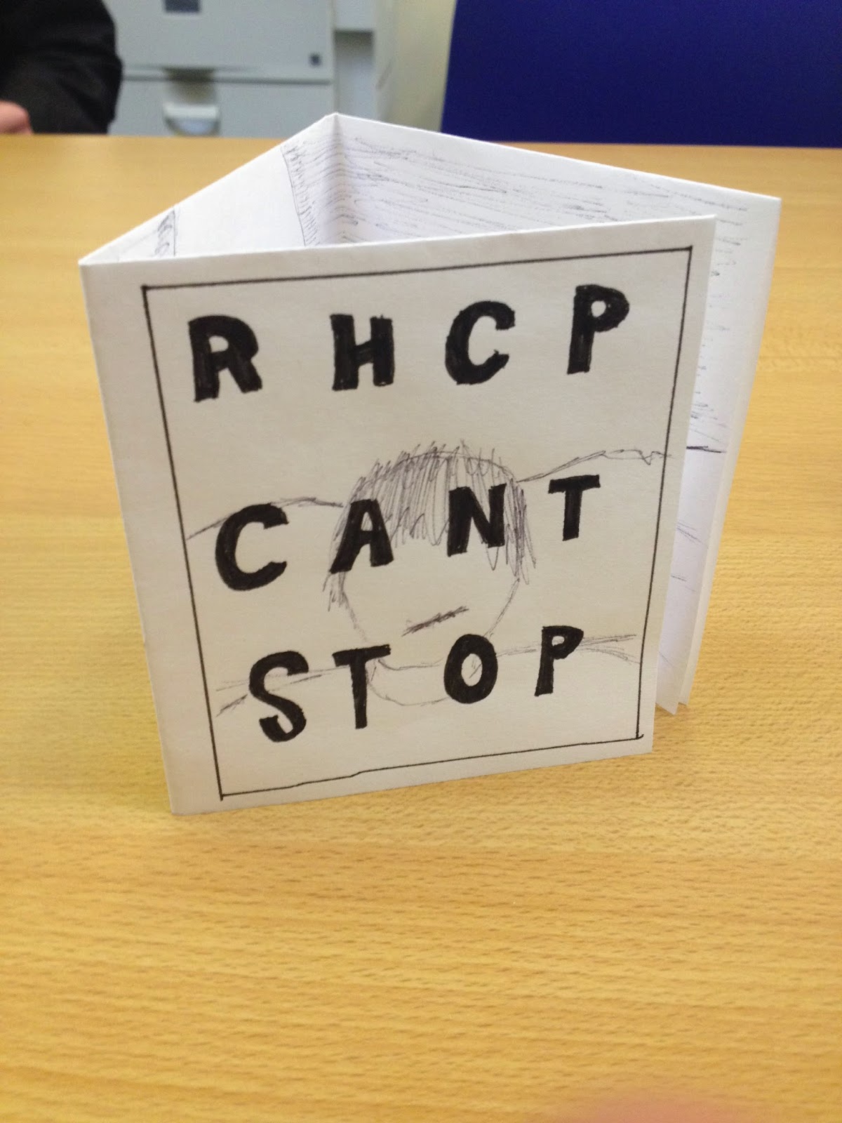
I decided to do a three pane digipak so I could put a panorama on the inside.


On the back I'm going to have the song list which will be printed onto a rock face with me standing off to the side. The back also has the legal notice and the bar code because otherwise it would not be able to be sold.

I decided that on the inside i would have an advert for the website and the music video that i was making. This meant that i needed to come up with some sort of way of advertising it.
Sunday, 11 January 2015
Recce Shots
Here are the Recce shots for where we have filmed, this is the Town Hall in Wem. Here are some of the pictures:


Digipak Research
There are many conventions of a digipak that most seem to use. A digipak is a form of CD case that is made of cardboard or other softer materials. This makes them cheaper to make and therefore mainly used by indie artists. The Digipak can take any design that the artist wants.


Subscribe to:
Comments (Atom)